Reading & Navigation
The sidebar
The left sidebar mirrors your vault's folder structure. Click any note to open it; folders collapse and expand, and Legible remembers what you left open.
Search
Press ⌘K to open search. Results appear as you type, ranked by relevance, with
a matching excerpt from each note. Hit Enter to open the top result, or use the
arrow keys to pick one.
Wikilinks and backlinks
Legible resolves Obsidian-style [[wikilinks]], including aliased links like
[[note|display text]] and heading links like [[note#section]]. Unresolved
links are styled distinctly so you can spot broken references.
At the bottom of each note, Backlinks shows every other note that links to the one you're reading, giving you the same connective tissue you rely on in Obsidian.
Themes
Legible ships a considered light mode and a dark mode that was designed as its own palette, not a mechanical inversion. Toggle between them with the sun/moon control; your choice is remembered.
Reading size
Use ⌘+ and ⌘- to scale the reading text up or down, and ⌘0 to reset. This
scales the note content only; the interface chrome stays put.
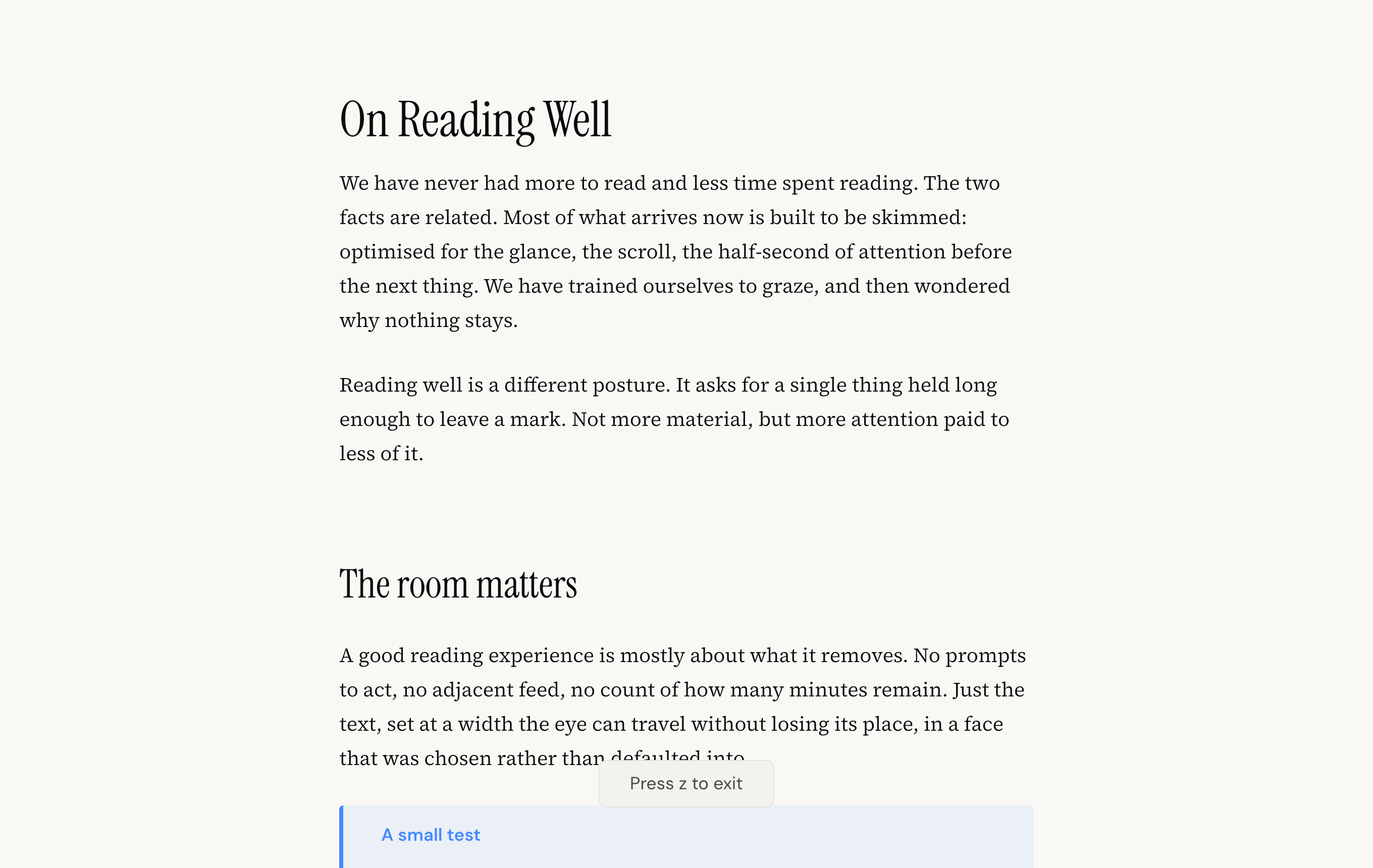
Zen mode
Press z, or use the zen control in the top bar, to drop everything but the
words. The sidebar, top bar and contents panel slide away and the note fills the
window at its ideal reading width. Press z again, or Esc, to bring the
interface back. Your reading size and theme carry over into zen mode.
Reading filters
Open Reading preferences in the top bar to switch the reading filter:
- Default: the standard palette.
- Sepia: a warm, low-glare tone for long reading sessions.
- High Contrast: stronger contrast for clarity and accessibility.
The filter sits on top of your light or dark theme and is remembered between sessions.
Heading style
The same Reading preferences panel lets you choose how headings are set:
- All serif: every heading uses the serif typeface, for one continuous editorial voice.
- Classic: headings use the interface sans-serif against the serif body, the more familiar document look.
Pick whichever reads better to you; the choice is remembered.
Edit in your own editor
Legible is a reader, not an editor, so when you want to change a note you open
it in the editor you already use. With a note open, use the Edit in control
in the top bar to hand the file to Obsidian, VS Code, Typora or your system
default for .md files.
Live reload
While a note is open in Legible, any change you save to that file on disk shows up immediately. Edit in your own editor on one side, watch it render in Legible on the other, with no refresh and no plugin.
Reading position
Legible remembers where you were in each note. Reopen a long note and it returns you to the spot you left, rather than jumping back to the top.